Showing posts with label SP 500. Show all posts

Thursday, January 26, 2012

Expecting Correction - In 1330 Target Zone

Several things are going on in the chart below that suggest a correction is imminent around current levels.

First is that RSI is at about 70. This is a usual overbought level after which a correction follows.

Second is that the 50 day moving average is near crossing the 200 day moving average. Although this is classically considered a bullish "golden cross," it can also be interpreted as a target area; consider the approaching of a golden cross as technical "news"-- sell the news. Earlier in the chart is a "death cross" which marked a bottom slightly earlier. A death cross also marked a price bottom in the Summer of 2010 correction.

The big blue boxes in the chart are approximate equal length, 62-65 points. I've circled in blue tops and bottoms which coincided with the box levels. Adding a box on top of the prior 1267 top yields a target of 1329-1332.

Adding all this evidence together makes for a bearish case, indicating a drop from current levels.

Monday, December 12, 2011

S&P 500 Intraday Bias, 11/12/11

At 9:50 AM, Negative, suggesting sell the rallies intrady.

Friday was the final bull-trap rally.

Thursday, December 8, 2011

S&P 500 Intraday Bias, 12/8/11

At 10:03 AM, Negative, suggesting sell the rallies intraday.

A topping pattern has been forming. This suggests the market will soon begin a swing down-- perhaps even today.

Recap of why I'm bearish.

Wednesday, November 30, 2011

I Don't Buy It

The price action of the last three days, which fits the "bear market rally" description, is not enough to change my thesis of a bear market. See links below.

The third phase
Analog
Commentary

The above analysis suggests this rally is another sell opportunity. I am not sure at what price, perhaps around 1250-1270, but don't hold me to that.

Wednesday, November 9, 2011

Bias and Commentary

This Saturday, I wrote "One can expect prices to continue forming a top around the 200 day moving average before the next leg down." Yesterday, prices once again hit the 200 day and now the S&P opened down 30 points. This choppy trading is a topping formation. If this thesis is correct--and evidence is mounting--the 1290 area will be the next "lower high" in a bear market, and a break below 1070 is the next significant move.

Today's bias at 9:45 AM, is negative, suggesting sell the rallies intraday.

Saturday, November 5, 2011

Distribution - First Leg - Recovery - Second Leg


The image above compares the earlier stages of the 2007-2009 bear market with the present. The 200 day MA is plotted on both charts. Based on the analog, one can expect prices to continue forming a top around the 200 day moving average before the next leg down.

Sunday, October 30, 2011

"Then the third phase begins..."

Evidence suggests that stocks are in a bear market.

The upper chart is the ratio of the equally weighted S&P 500 to the popular, market cap weighted S&P 500. This ratio is a measure of internal market strength. Note that a big divergence between the actual S&P, the lower chart, and the ratio has formed.

The green box noted "major topping formation" is synonymous with "distribution" in following quotation from Edwards and Magee's Technical Analysis of Stock Trends. It describes this year very well.

"Primary Downtrends are also usually (but again, not invariably) characterized by three phases. The first is the distribution period (which really starts in the later stages of the preceding Bull Market). During this phase, farsighted investors sense the fact that business earnings have reached an abnormal height and unload their holdings at an increasing pace. Trading volume is still high, though tending to diminish on rallies, and the “public” is still active but beginning to show signs of frustration as hoped-for profits fade away.

The second phase is the Panic Phase. Buyers begin to thin out and sellers become more urgent; the downward trend of prices suddenly accelerates into an almost vertical drop, while volume mounts to climactic proportions. After the Panic Phase (which usually runs too far relative to then-existing business conditions), there may be a fairly long Secondary Recovery or a sideways movement, and then the third phase begins."

The third phase is another down leg.

Thursday, October 27, 2011

Resistance

spx is at its 200 day moving average, which should act as resistance. I believe that it is a good time to begin selling.

this post was written from my android phone. I currently don't have a internet connection

Tuesday, October 4, 2011

Seems like a bullish trend reversal day

Also...

If the above wave count is correct, a 3-wave counter trend rally is in the horizon.

Friday, September 23, 2011

Market Profile Says: Expect More Trading Between 1150-1190

Today, I asked myself, "Will the market spend more time trading between 1100 and 1230, or is it about to break out?" A technical method that aids in answering this question is a "Market Profile" chart. (One day, this method will probably be as run-of-the-mill as others.) In such charts, the y-axis is price and the x-axis is the frequency of how many times the market traded at that price for a given time interval, just as a bar chart can be from 1-min to quarterly, over a given period.

According to market profile, when prices are range bound, they usually spend the most time, i.e. have the highest frequency, around the center of the range, forming a sideways bell curve. It is not until this bell curve is complete that prices begin to break out to a new trading range. These charts are also fractal in nature, with smaller bell curves making up a portion of a greater curve.

I constructed a market profile chart of the last couple of months based on the range of prices for 30 minute time intervals. (There are software vendors for market profile, but I created this study on excel.) During this time period, prices have swayed between 1100 and 1230 several times. As you can see in the chart below, two minor bell curves have formed that are part of larger distribution in which the center area, which should have the highest frequency, has yet to fill. The conclusion from this chart is, more trading should occur between 1150-1190, the unfilled center of the distribution.

Now, a conclusion from one technical study is far, far from definitive. The reason I post this is to offer a perspective not as easily encounterable elsewhere on this financial blogosphere, especially now when a break below 1100 seems imminent.

Wednesday, September 21, 2011

The Fat Lady


The chart posted is of the semiconductor index. It is inches from a textbook support area, that is, the previous highs that prices broke above. I believe whether it breaks or not will be serve as confirmation of what's to come.

Monday, September 12, 2011

Semi Bullish


The semiconductor index was in positive territory the entire trading day, and closed up over 3%. The horizontal line in the chart is a bullish breakout level.


This chart is the ratio of the semiconductor index to consumer staples, a contrast of a hyper-sensitive, cyclical industry, with a defensive sector. A break above the trendline, and a first higher-low, higher-high in a long time may occur soon.


Above are the relative strength lines of consumer discretionary, technology, and transports, respectively, against the S&P 500. According to John Murphy's work on sector rotation, in that order, those sectors show relative strength as the economy moves from a late contraction to early expansion phase. The charts are following that script, suggesting we will see an uptick in the economy.

I am inclined to conclude that the next significant development is for the S&P 500 to reach its 200 day moving average, currently at 1283. Treasuries and Gold should correct.

Sunday, September 11, 2011

Elliott Wave for Thought


Above are three identical charts, each showing a different Elliot Wave interpretation, "count."

The first count is impossible because, according to the rigid rules of Elliott Wave, wave-4 cannot overlap wave-1. The count is deceptive because for anyone bullish, the corrective waves 2 and 4 are pretty similar in nature.

Given that the first chart can be ruled out, we are left with two possibilities. The most likely is chart two, in which the bull market from 2009 to 2011 was a counter trend, a-b-c, that is part of a larger bear market than began in 2007.

The only valid count that is bullish is the third chart, in which this current correction, not being a wave-4, can overlap wave-1. This is possible by classifying this correction as sub-wave-ii of wave-3 (of a five wave advance.)

I don't necessarily believe in Elliott Wave, but this post is my best assessment--which I am very confidence is accurate--of the market according to the theory's principles.

Friday, September 2, 2011

Is ES 1175 a buy?


Things happen so quickly in this market. The drop from 1230 to 1175 over a two day span is a drop equivalent to the previous drop from 1190 to 1135. Moreover, 1175, hit today, fills a gap exactly. I have neither the courage, nor the preparation to buy, but I feel that this is worth pointing out. If a base forms around 1175 (on ES), that would build courage.

Thursday, September 1, 2011

Update

Added: prices shot upward with the positive surprise from 10 AM's economic news. If the market gives up these gains today, I will presume that a new swing downward is beginning. If strength continues, I reaffirm my 1250-1260 target.

Tuesday, August 30, 2011

In the Cards


Now that SPX has met my objective of surpassing 1208, which I wrote when it was in the 1130s, here, I see a move to 1250-1260, followed by a drop to 1200, then a move to 1295ish. The circles are the points of contact along the resistance levels.

To me, this is possible because a) short squeeze territory is above 1250 b)the 200 day MA or EMA can be around 1280-1300 if and when prices reach there and c)a retracement that large before another drop conforms to the market's habit of being deceptive.

Tuesday, August 23, 2011

Comment

The S&P seems to be forming a double bottom and may soon begin a move above 1208, perhaps today.

Monday, August 15, 2011

Sold BGU at 58.10

At 3:27PM, when SPX was at about 1200. (I originally bought in the low 1180s.)

I sold in order to play it safe, but I think 1250 is in the cards before another downturn in prices.

Saturday, August 6, 2011

Correction Target


Above is the NYSE advance-decline line with its 200 day moving average. On Friday, the moving average was penetrated although the line closed slightly above it. This is the first time in the bull market that the 200 day MA was tested, usually producing the strongest bounce. This, along with Friday's price action, suggests that a rally is due, anywhere from 1250-1300.

Friday, August 5, 2011

However...

(Added: Today's bias is negative. The high of the day so far was 1200+18. A symmetric 1200-18 is 1182. I am buying if we get there!)

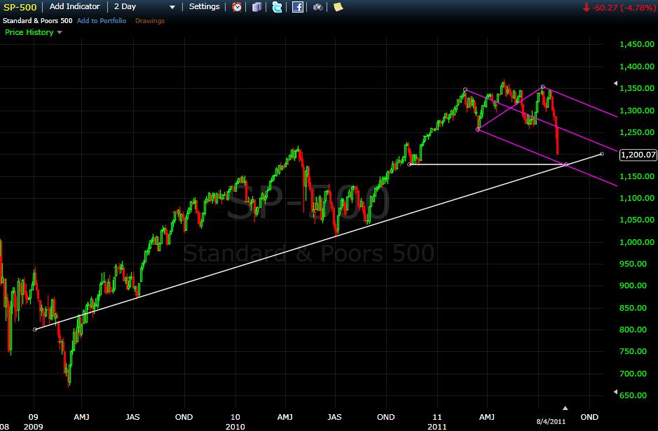
RSI on most indexes is below 30. A break below 30 usually signifies a continuation of the current direction-- momentum overcomes reversion to the mean. Moreover, many trendlines have been pierced.

Back to momentum, treasuries are also providing a clue that there may be a bit more to go.

Another possibility is another 25-30 point rally followed by one more move lower, say, to 1175. I prefer 1175 to the 1185-1190 targets given by the analysis in the previous post. Below are three intersecting trendlines at 1175; two are basic trendlines, the third comes from an "Andrew's pitchfork".